Certain colours do seem to have a universal meaning across all cultures, and enable us to communicate more effectively. Green, for example, is always associated with safety, which makes its use in traffic signals very important. It is also synonymous with growth, and he concept of the 'new', which leads to its use in advertising new products, which someone can understand even if they cant read the language it is written in.
Another example, if an obvious one, is gold. Its associate with money and wealth is inseparable in all cultures where gold has been refined and/or used as currency. Because of this, gold is also associated with success and importance.
Obviously, this is not the same for all the meanings of a colour though. For example, yellow is synonymous with happiness and positivity in the west, but is the colour of mourning in Egypt so would be heavily associated with unhappiness.
Sunday, January 15, 2012
Mark Rothko
I've always liked the paintings of Mark Rothko, as they have a kind mysticism and intensity to them, and are reminiscent of landscapes with with a deep psychological element.
The colours have a kind of thickness and substance to them, and despite often being very opaque, they seem to have a kind of depth, and you get the sense that you can move through them in some way.
He uses quite simple colour schemes, but uses them evocatively, especially his red and black pieces.


The colours have a kind of thickness and substance to them, and despite often being very opaque, they seem to have a kind of depth, and you get the sense that you can move through them in some way.
He uses quite simple colour schemes, but uses them evocatively, especially his red and black pieces.


Default Windows Desktop Background
I’m always pretty interested to see what the default background for a new operating system will be, as they’ve got to be one of the most carefully designed single images that the company ever makes.
If we look at the current Windows 7 background, we can see that windows logo is bang in the middle, but with pretty much all the rest of the image directing your attention to the bottom left;

What this does is subconsciously direct your attention to the start button, which basically acts as a gateway to everything on your computer
Your attention is also drawn to the left side of the screen generally by the fact its lighter an more active, and that’s where microsoft want it to be as its where all your files and program shortcuts are automatically placed.
Its also worth noting that blue is by far the main colour of the image, which helps to calm the viewer and lower their blood pressure, which is helps to avoid frustration when using the operating system.
if you compare this to the default Mac OSX background, we can see a slightly different metholodogy at work:

In OSX, files and folders are automatically placed on the right, while shortcuts are either on the left or the bottom, in the dock. This means the image has to bridge both the left and right sides of screen, which simultaneously leaving room for the dock and directing the viewers attention toward it.
In this case, we can see the rays of light acting a bridge, and the area of high activity and light in the lower middle draws our eyes toward where the dock will be, while the area of dark at the bottom leaves enough space for the dock and makes sure that the background doesn’t detract from the icons on the dock itself.
Thursday, January 12, 2012
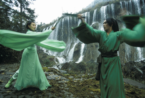
Use of colour in the film Hero
In Hero, use of colour and narrative are intertwined, as the same story is told 3 times from different viewpoints, and a different colour is dominant in each retelling to differentiate them. This not only makes the story easier to follow, but ads to the drama and atmosphere of each retelling.
The ‘blue version’, for example is very calm and crisp, with some reflection and introspection, whereas the ‘red version’ is emotional and passionate, with love and betrayal being the main themes.
This kind of technique creates a very visually distinctive style and helps structure the piece. Similar uses can be found in games, with different themed areas helping break up the narrative and enhance the sense of progression.


Wednesday, January 11, 2012
Making Space Interesting
Portraying space, or more correctly the starfield, in scifi games presents an interesting problem; In real life its pretty boring, and everything is really dark:

some of the little dots are tinted different colours, but that’s pretty much it. There isn’t really much colour to work with at all, so conveying a sense of location, or trying to differentiate between two different locations, is really difficult.
The game ‘X3’ tries to get around this by having backdrops that are almost realistic, but with just enough of a hint of colour to make them interesting:


In contrast, Eve Online went as expressive as possible, using false colour hubble images of nebulae as inspiration for its backdrops;


By doing this, Eve is able to create distinctive locations in space with different colour schemes. Its technically unrealistic, but is reminiscent of real images of space (which are admittedly false colour), so doesn’t seem incongruous.
Tuesday, January 10, 2012
Movie Bar Codes
MovieBarCodes (http://moviebarcode.tumblr.com) is an interesting gallery of films compressed into a single image, which shows a very abstract kind of colour script for each film. It shows how films progress, and how colour and narrative link together.
The Matrix:

The Godfather:

Hero:

The Matrix:

The Godfather:
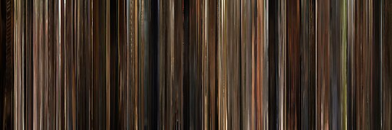
Hero:
Sunday, January 8, 2012
Apple's iPod Ads
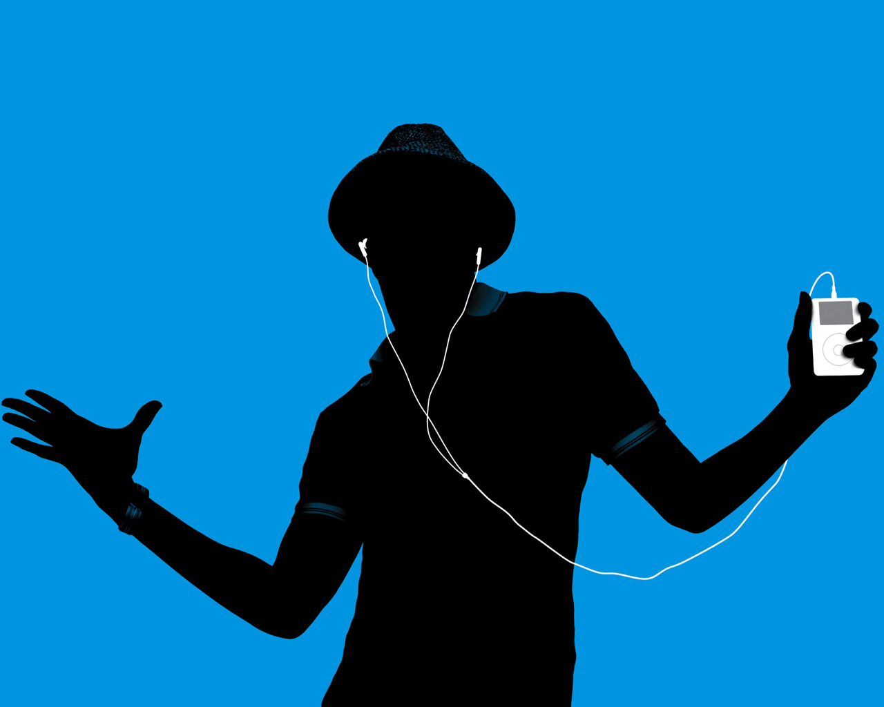
Apples iPod silhouette Ad’s are interesting in that they’re a simple yet effective way of making a small lump of plastic, metal and silicon seem vibrant dynamic and exiting.
By 2003 Apple had already established is products image as being sleek, minimalist, and slylish;

However it wasn’t exactly exciting. The simplistic, high-saturation silhouettes managed to give the iPod a sense of energy, while still sticking to Apple’s successful design methodology.
The iPod itself has always been white, black, and grey, but this hasn’t seemed to have mattered much, probably because as a music player its visual component isn’t as important as the idea.
Tuesday, January 3, 2012
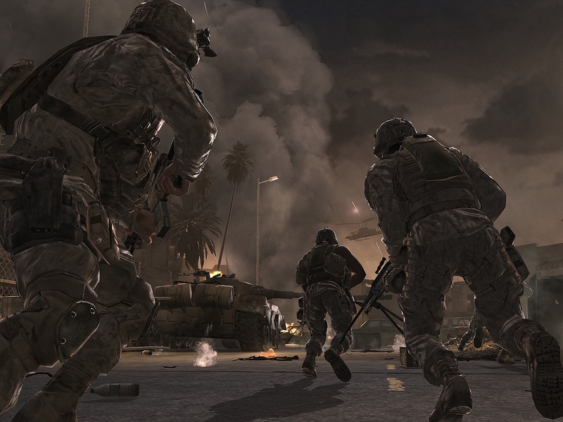
Brown Fatigue
One of the main visual design problems in games is the ubiquity of brown and grey, which is in part due to the subject matter of the game, but also in part due to misconceptions about what the players want.
If you look at perhaps the 3 most popular game franchises of recent years (Gears of War, Call of Duty, and Grand Theft Auto), you begin to see a pattern emerging:


It might be in part due to the fact these games are supposed to be ‘macho’, and apparently they’ve decided that brown is the most manly colour, but there is also the fact that they’re are trying to achieve realism (or some aspects of it, at least), and in often cases the kind of world they are drawing inspiration from in fact brown:

However there are games that are trying to buck this trend, and games such as Enslaved: Odyssey To The West show that you can even make a compelling post apocalyptic world with colours other than brown:

This screenshot is actually quite interesting in that the use of green actually gives the use of brown more power through juxtaposition, whereas overusing brown will just wash everything out and rob the colour of its intensity.
If you look at perhaps the 3 most popular game franchises of recent years (Gears of War, Call of Duty, and Grand Theft Auto), you begin to see a pattern emerging:


It might be in part due to the fact these games are supposed to be ‘macho’, and apparently they’ve decided that brown is the most manly colour, but there is also the fact that they’re are trying to achieve realism (or some aspects of it, at least), and in often cases the kind of world they are drawing inspiration from in fact brown:
However there are games that are trying to buck this trend, and games such as Enslaved: Odyssey To The West show that you can even make a compelling post apocalyptic world with colours other than brown:

This screenshot is actually quite interesting in that the use of green actually gives the use of brown more power through juxtaposition, whereas overusing brown will just wash everything out and rob the colour of its intensity.
Wednesday, December 28, 2011
Andy Goldsworthy
Goldsworthy creates very ‘portal-like’ areas of black that look like infinite pools, that seem to blend between 2D and 3D, or at least give he impression of a 2 dimensional plane in a 3D environment.
I’ve always thought they’re really good at conveying the idea that darkness is just the absence of light.


I’ve always thought they’re really good at conveying the idea that darkness is just the absence of light.


Tuesday, December 27, 2011
The Colour Palette in Portal
The environment design of features 2 main colour schemes; the cold blues and whites of the test chambers:

And the warm oranges and browns of the secret hideouts:

The blues and whites reflect the sterile and impersonal nature of the test chambers, whereas the oranges and browns help to convey a more human element, that ties into the idea that these areas have been inhabited by people rather than machines. This colour palette is repeated throughout the game, with the blue and orange portals, for example.
Friday, December 23, 2011
Sunsets in Skyrim
Changing the colour palette of a piece can create a dramatic effect, and in games this can be used to enhance an already existing atmosphere, or to create an entirely new one.
A good example of this are the sunsets in Skyrim. Though the landscape does not change at all the feeling and atmosphere of the environment shifts massively whenever a sunset occurs. The Landscape goes from being harsh and wild to still and contemplative, even though the only thing that has happened is that the colour scheme has moved from whites and browns to reds and oranges:


(obviously in these images the environments do change, but I could find screenshots of the same environment with and without a sunset.
Thursday, December 22, 2011
Colour and Money
The colour red is associated with money in a number of way, some which of which are interestingly contradictory.
For example, in the west, it is bad to be ‘in the red’, as not only does mean you don’t have money, but it also suggests you’ve lost money. Whereas in China, red is synonymous with gaining money, as red envelopes with money in are given or exchanged during many special occasions such as weddings or the new year celebrations.
This suggests that there is no inherent link between money and the colour red, but instead one that is built entirely by cultural association.
Saturday, December 17, 2011
Black Cars
In car design, the power, elegance, and mystery of black are leveraged to create the idea of a car that is ‘better than other cars’. Companies like BWM and Mercedes promote black cars as a measure of sophistication and success, and Henry Ford famously said of the Model T, that “a customer can have the car in any colour he wants, so long as its black”. Although originally a sign of wealth, the Model T went on to massively popularise the use of cars, with black Model T’s becoming ubiquitous throughout the early 1900s.

Wednesday, December 14, 2011
Royal Colours
In the west, the colour purple is associated with royalty and nobility, as purple dye was hard to obtain, and so was only affordable to the rich. The reason for this was that the only purple dye available at the time, Tyrian Purple, could only be obtained from the mucous of a small number of Eastern Mediterranean sea snails
In China, Yellow is traditionally the ‘Imperial colour’, but for historical and mythological reasons, rather than the availability of the dye. The yellow dragon has always been the symbol of the emperor, to the point where the legendary Emperor Huang Di was said to become a yellow dragon when he died. According to tradition, yellow was exclusively worn by the Chinese Imperial family, and a certain points in history it became illegal for anyone outside the royal family to war it, punishable by death.
In China, Yellow is traditionally the ‘Imperial colour’, but for historical and mythological reasons, rather than the availability of the dye. The yellow dragon has always been the symbol of the emperor, to the point where the legendary Emperor Huang Di was said to become a yellow dragon when he died. According to tradition, yellow was exclusively worn by the Chinese Imperial family, and a certain points in history it became illegal for anyone outside the royal family to war it, punishable by death.
Thursday, December 8, 2011
Physiological effects of colour
Observing the colour red has been shown to increase the bodies respiration rate and blood pressure, whereas blue lowers it. Deep blue can stimulate the pituitary gland which controls the bodies sleep pattern, so can induce more regular and restful sleep cycles.
Yellow stimulates the brain and makes it more alert and decisive, hence why caution signs are often yellow and black. It can even generate muscle energy.
Green is the ‘easiest’ colour to look at, as it doesn’t generate any energy or stimulate the brain, so is associated with relaxation and tranquility.
Orange is used as an appetite stimulant in restaurants, and like red increases respiration and oxygen supply to the brain.
Subscribe to:
Comments (Atom)